
If there’s one thing we can be certain of, we live in a mobile society. We are multi-taskers. We want information handed to us within seconds. We want solutions at the tap of a button. In fact, research suggests half of us now do our shopping on a mobile device and will quickly abandon a website that doesn’t have a mobile-friendly site. The impact of a good mobile website design is more significant than ever. Google reports more than half of its searches originate from mobile devices, so the opportunity is there to put your business in front of online consumers, but you need to know how.
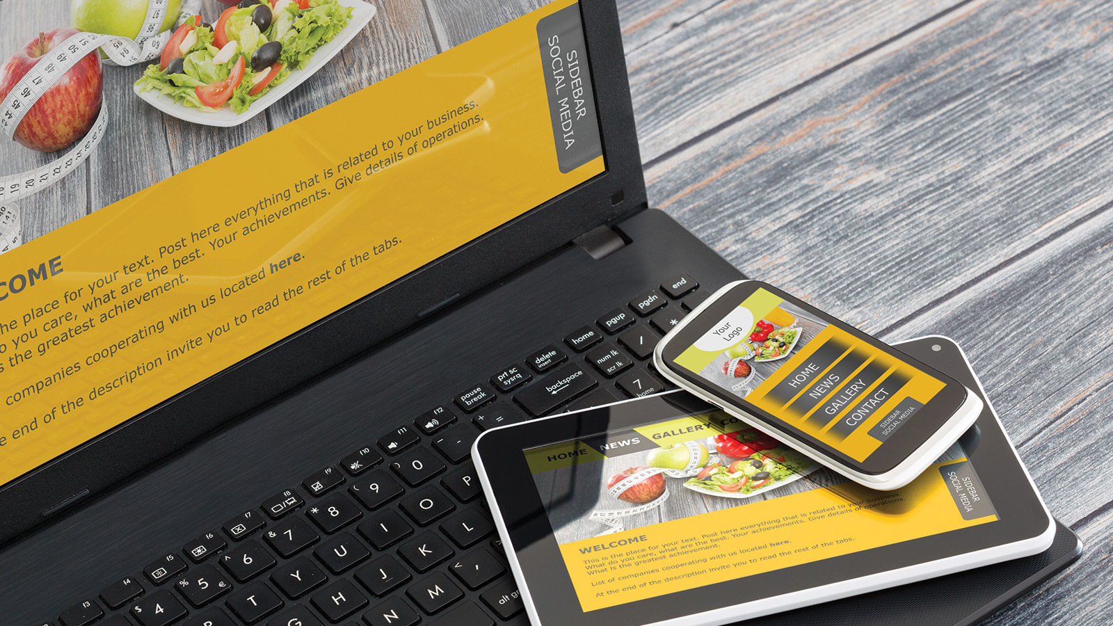
Mobile Landing Page
The belief that your customers will visit your full site on their cell phone or tablet, zoom in to find what they need, and attempt to click the right area is long gone. Customers demand convenience, and 61% of customers say if your site is not mobile friendly, they’ll likely leave. On the contrary, 74% of shoppers say they’ll return to your site if it’s mobile friendly.
Even if you’re thinking the demand for mobile website design doesn’t affect you because you don’t sell your products or services online, you need to think again. Roughly 50% of mobile users who searched for a local company actually visited the business, while only 34% of people who looked for a business on their desktop or tablet went to the store.
Make It Fast
Heavy images or too much specialty coding can slow down your mobile site. Optimizing your images will improve your load times – and you’re going to need it. More than half – 57 percent – of mobile users will leave a website that takes longer than three seconds to load. Remove images completely when possible, but if you want to stick with the graphics, use the right type. Vector images work well with responsive design and are perfect for non-photo displays.
Make The Conversion
Mobile website design helps increase conversion. Whether you partner with a Detroit web design company, or take on building the mobile site yourself, the focus needs to be on the call to action. What do you want your customer to do once they come to your mobile landing page? Some elements to consider:
- Click to call option
- Make reservations now (For restaurants, entertainment, etc.)
- Contact us (Give physical address, phone number, and email option)
Less Is More
From pictures to text, less is more. The focus of your mobile landing page should be the call-to-action. Include a minimal amount of text, and place all emphasis on exactly what you want the customer to do. Remove words or phrases that don’t add to your marketing efforts. Be concise and make each word necessary and powerful.
Mobile use has not only surpassed desktop use, but the numbers continue to grow. As we become more dependent on having information at our fingertips, we’ll rely even more on on-the-go answers. Meet your customers where they are. Upgrade your mobile website design today with a leading Detroit web design company. We’ll help you take the stress out of simplifying your mobile site.